Shogo Nishiwaki (Sign language artist) – Storyteller of the appeal of deaf community
2025.04.08
Creative Director/Designer
2024.11.27
The World Athletics Championships will be held in Tokyo for the first time in 34 years since 1991.
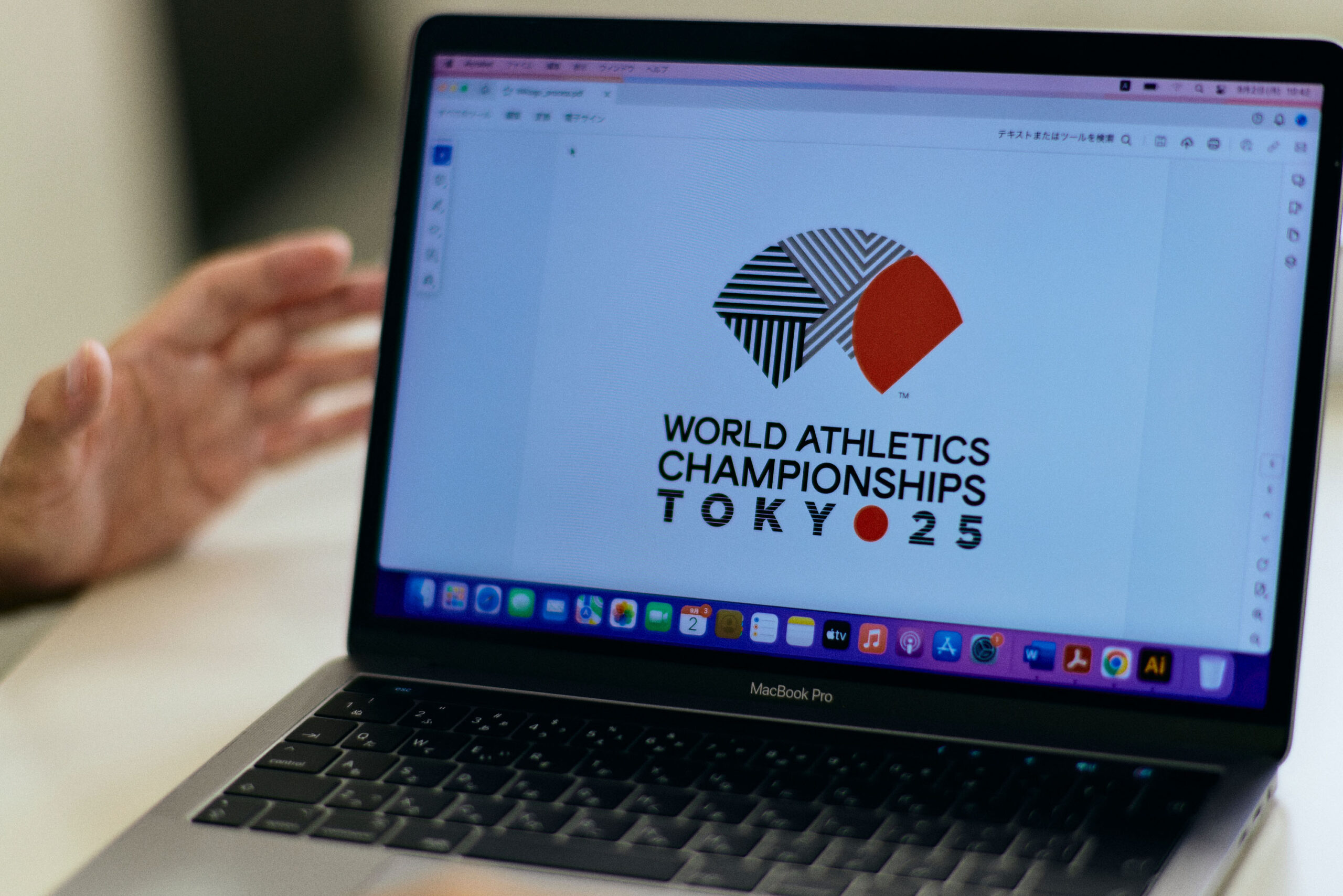
Ryo Nakagawa designed the logo that symbolizes the tournament.
The logo was selected from among 368 entries through a public submission.
Full of elegance and dynamism with TYO – the city code for Tokyo as a motif.
And the traditional beauty of Japan.
Nakagawa’s passion for the logo, as he loves sports and design.
And what is the “beauty” that he has built up in his career.
―Your logo has been chosen as the logo for the World Athletics Championships Tokyo 25. Please tell me honestly how you felt when you heard the news.
Nakagawa I was really happy. In competitions and public submissions like this one, no matter how good I think my work is, I have no idea whether my logo will be selected or not. The difficult part is that I can’t go to the screening site and explain it myself, and I don’t know what kind of people will choose and what criteria they will use. There are various types of designers, and some people are highly sensitive and create intuitively. However, I’m the type of person who first analyzes the design before starting, and organizes information about what is required and what criteria should be used when designing. I am the type of person who place importance on verbal sharing between the purchaser and the creator, and design while coordinating words so that both parties can face the work from the same position, so in that sense, competitions and public submissions are difficult for me. That is why I was really happy when I received the call that I had been selected.
―What regulations did you follow when creating the logo?
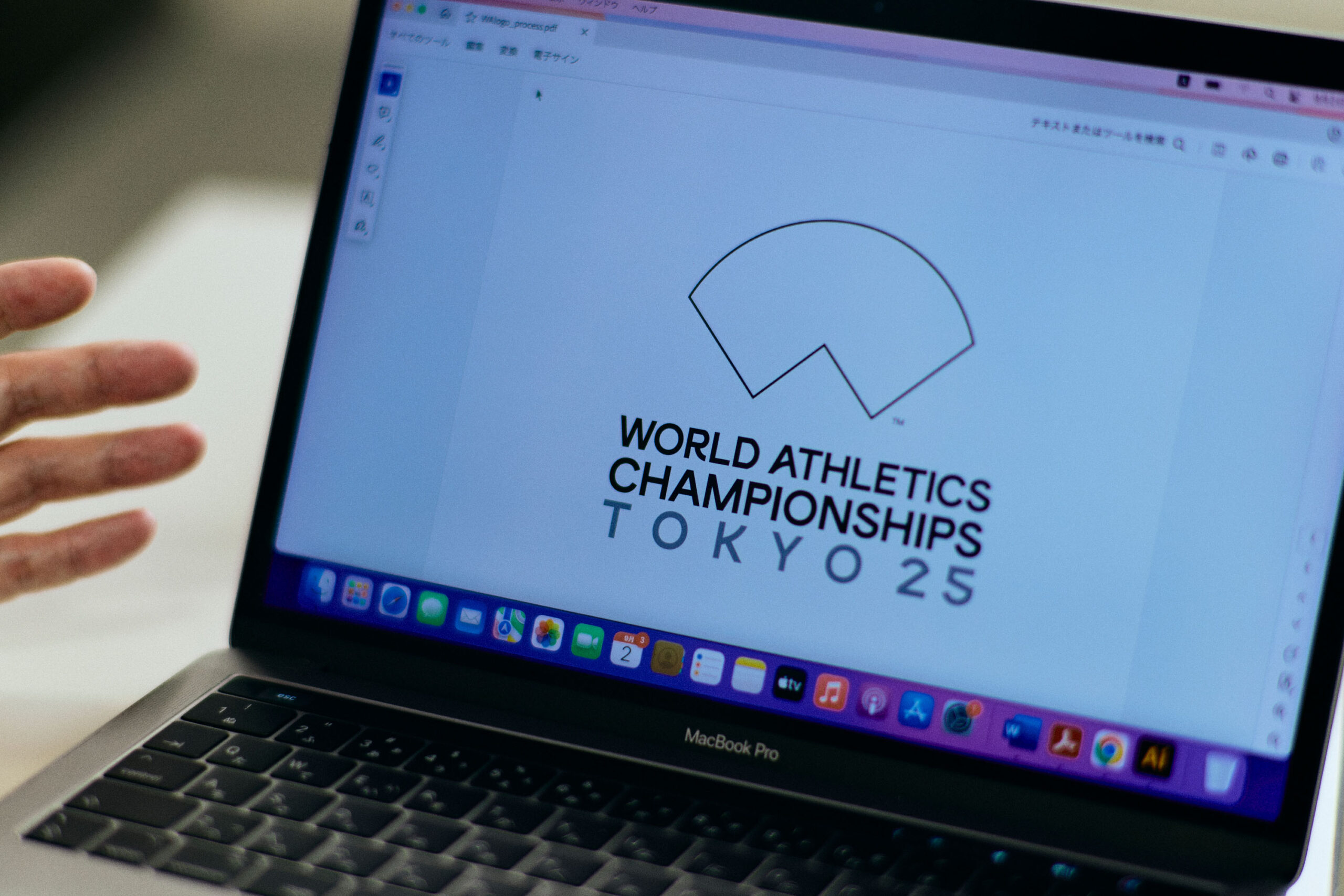
Nakagawa That is the interesting part. In 2019, when the International Association of Athletics Federations changed its name to “World Athletics” , the logo was redesigned. Accordingly, it has been decided that all subsequent tournaments sponsored by World Athletics will use the outer frame of the logo, in other words, the fan shape. This time it was the same, and the template was to use the fan shape for the outer frame and the words “WORLD ATHLETICS CHAMPIONSHIPS”, and the requirement was to design the inside of the fan shape and the words “TOKYO 25”. In general logo competitions, the design is often free, so it is very rare to have a rule like this. In addition to that, other specific things we were looking for in the logo were “Tokyo-ness” and “the dynamism of sports”.
―I think it would be difficult to have a fixed outer frame.
Nakagawa It was my first experience designing within a fixed outer frame, so I was worried about that. Perhaps the challenge this time was how to make use of the outer frame for other applicants as well. If you look into past logos for World Athletics, most of them have a frame with a map or something famous about the area inside. There were a few things that were shown in color composition, but I wonder if the outer frame is inevitable… Since that was the rule, many of the pieces felt like I had put something inside, so I decided to bring the work to a point where it looked like I had designed the frame itself.
―How did you actually make the design?
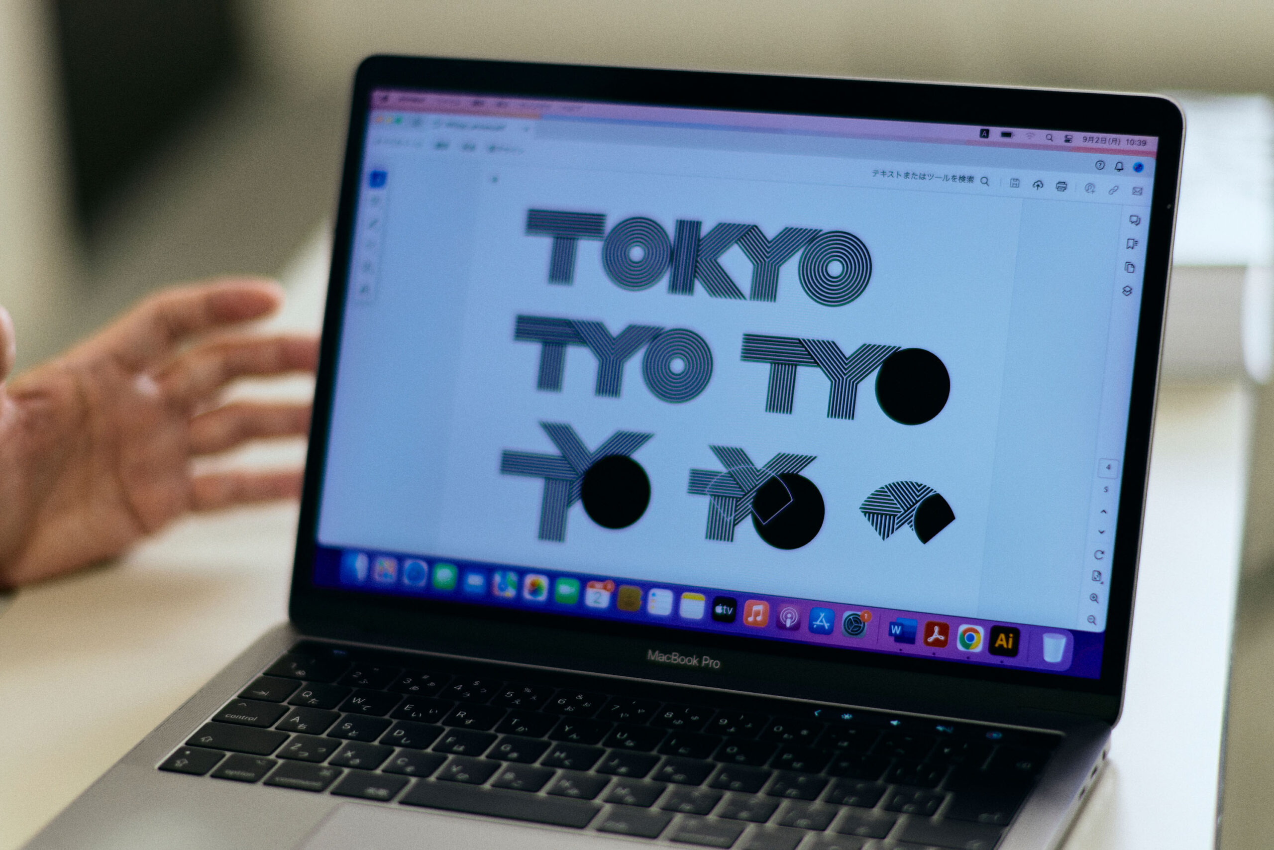
Nakagawa 「Based on the association of “Tokyo-ness”, I started with the design of the word “Tokyo”. Why I started from the letters… is that that I personally like the design of the letters. Tokyo is represented as “TOKYO” in alphabets, the letters are striped, and the stripes have 8 to 9 lines to represent the lanes of a track and field track… At that time, I couldn’t fit the five letters of TOKYO into the frame, so I came up with TYO – the city code for Tokyo. Cities around the world each have a city code that is represented by three letters, such as LAX for Los Angeles and NYC for New York. TYO for Tokyo. The outer frame is made up of a 45-degree angle and a perfect circle, so the elements you put inside should only use a perfect circle and a 45-degree angle. I rearranged the shape of TYO, changed its position, and finally made some adjustments to decide where to cut out the TYO letters.
―How did you decide on the colors you used?
Nakagawa At first I thought it would be fine to use just one color as the shape is beautiful. But I wanted to have “red” which is the color of the Japanese flag of the rising sun. So, I used red for the letter “O”. And not only in track and field, but in other sports as well, athletes strive to win “gold”. This friendly rivalry is the great value of sports, so I used it to mean that everyone who works hard deserves gold.
The other color “black” represents diversity and harmony. Each participating country has its own color. There are many different colors such as national flag colors, skin and hair colors, but which color represents everyone in the world? When asked this question, we don’t know…. But when you mix all the various colors it becomes black in the end. That’s why I think black is appropriate to represent diversity and the harmony in which people around the world connect and intermingle.
Red and gold are also the colors of festivals felt by Japanese people. The logo’s three-color palette represents a festive feeling and traditional Japanese sense of beauty.
―How did you feel when the design was completed?
Nakagawa It has a Japanese image like a folding fan, and I think the connection of the stripes, which represent the lanes of a track and field track, is a way to express the connection between athletes from around the world and Tokyo, and the idea that people from all over the world gather in Tokyo. I am very satisfied with the design, which has a Japanese feel to it.
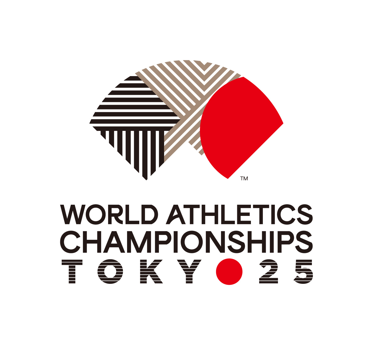
―The logo is a simple and cool design which evokes a sense of Japanese feeling.
Nakagawa I think it gives a simple impression because it doesn’t have too many elements, and the outer frame and interior design and structure match well. In fact, I often receive such impressions. I was happy to hear the words from women’s javelin thrower Haruka Kitaguchi “It feels both new and traditional” who appeared on stage together at the logo announcement event.
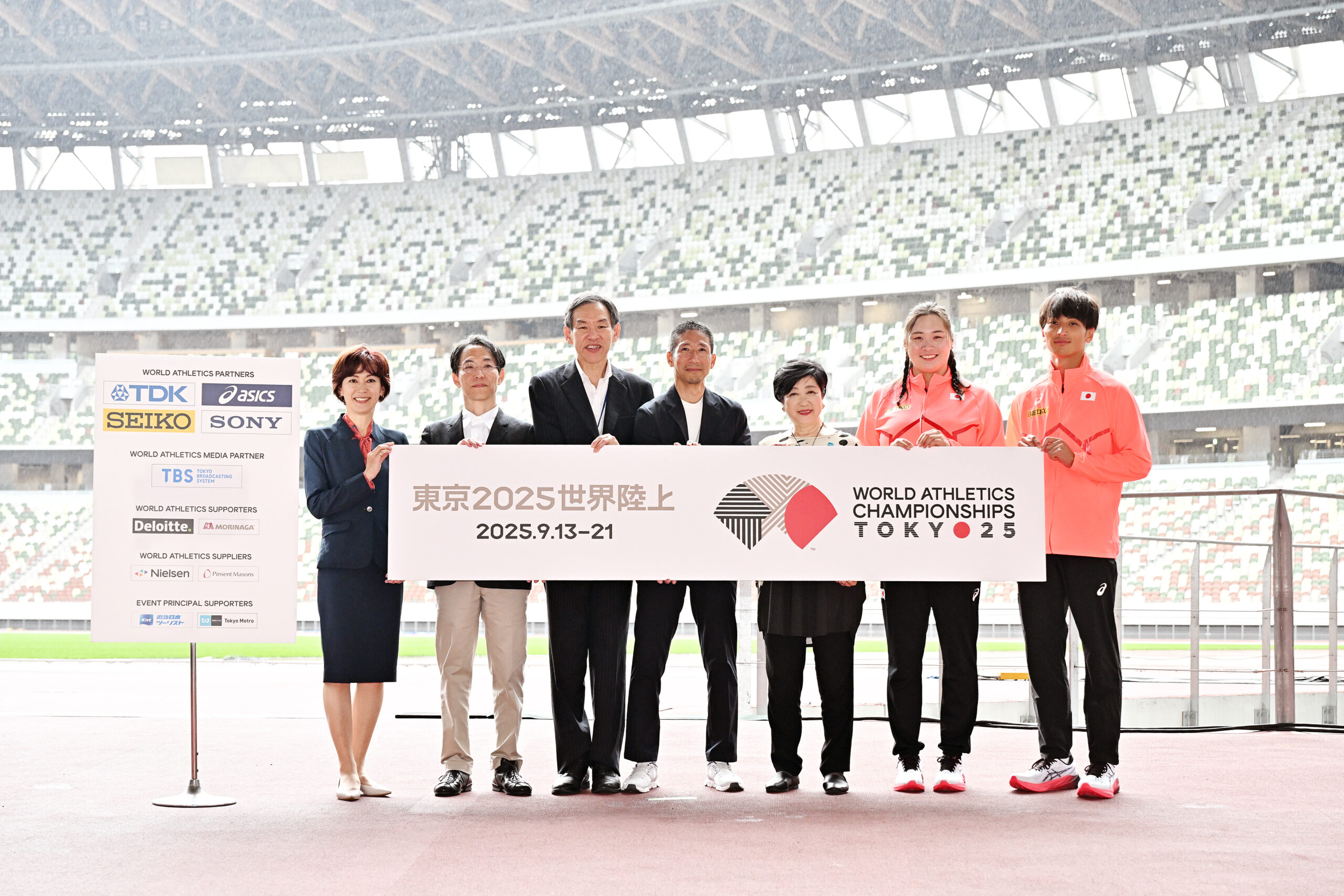
―You mentioned that you would not be able to attend the screening panel, but were you able to ask the reason why your work was selected this time?
Nakagawa Yes, I was able to ask the reason. While some people said that it would be nice to have something colorful, showy, or event-like, one athlete said “For runners, all the time up to that point is condensed at the moment of the start. And that moment is so quiet that even with 50,000 spectators, you could hear the heartbeat of the runner next to you. I like the quiet and tense moment of the start the most and the moment it starts the cheers went up, and after a moment of silence, it was filled with tremendous cheers. The 100m race can be won in just over 9 seconds, and the contrast is nice”. Also, as a professional designer said, “the logo design will be used for three-dimensional objects including medals”, it seems that there was a discussion that it was not necessary to seek just glamor. In that sense, the logo I created had a sense of tension and quiet beauty. In the end, it seems that the logo was won with a unanimous vote. After hearing this, I felt that the logo design selection committee members had properly discussed “what would be appropriate for the World Athletics Championships Tokyo 25”. I was very happy that I was chosen as a result.
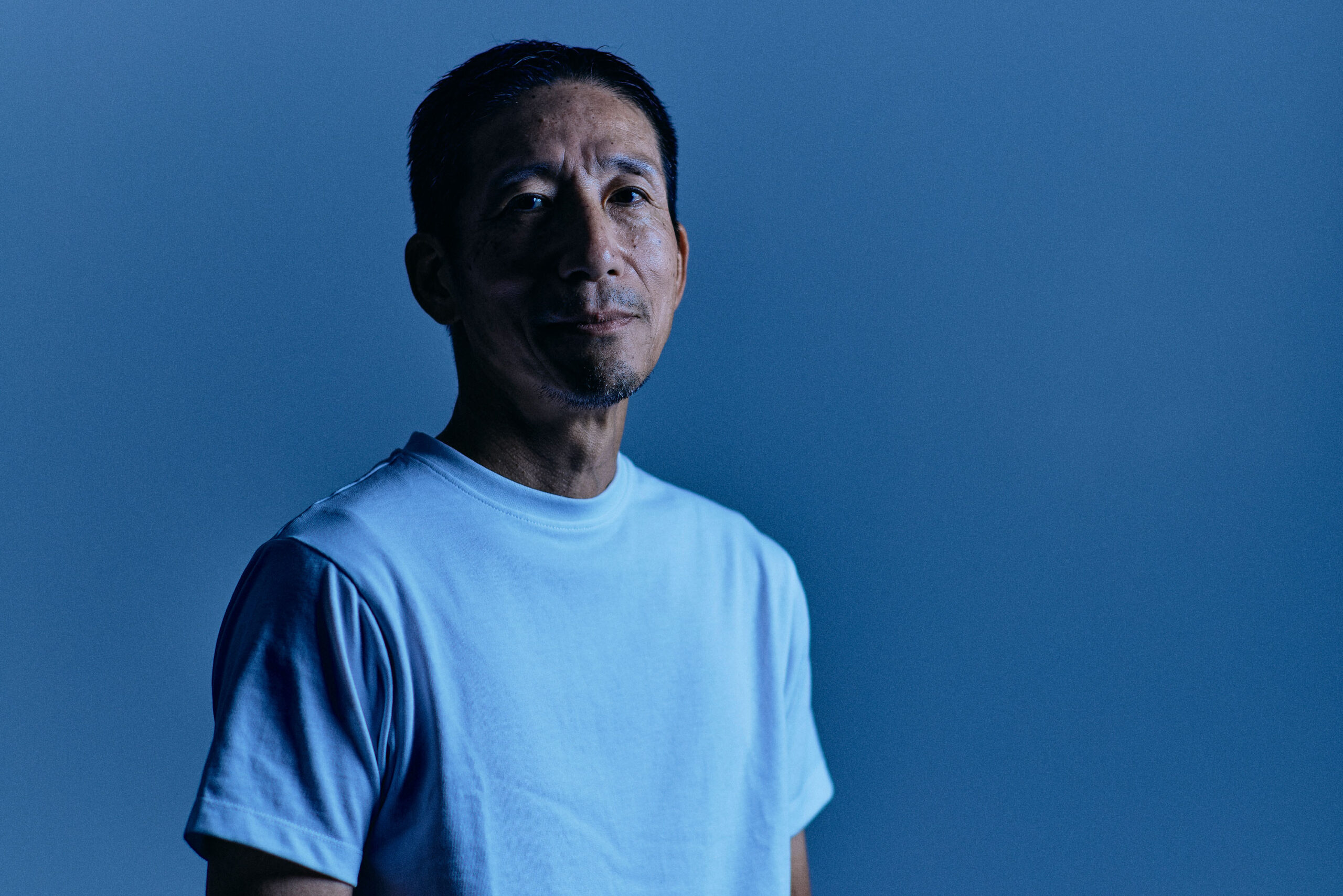
―Were you good at drawing since you were a child?
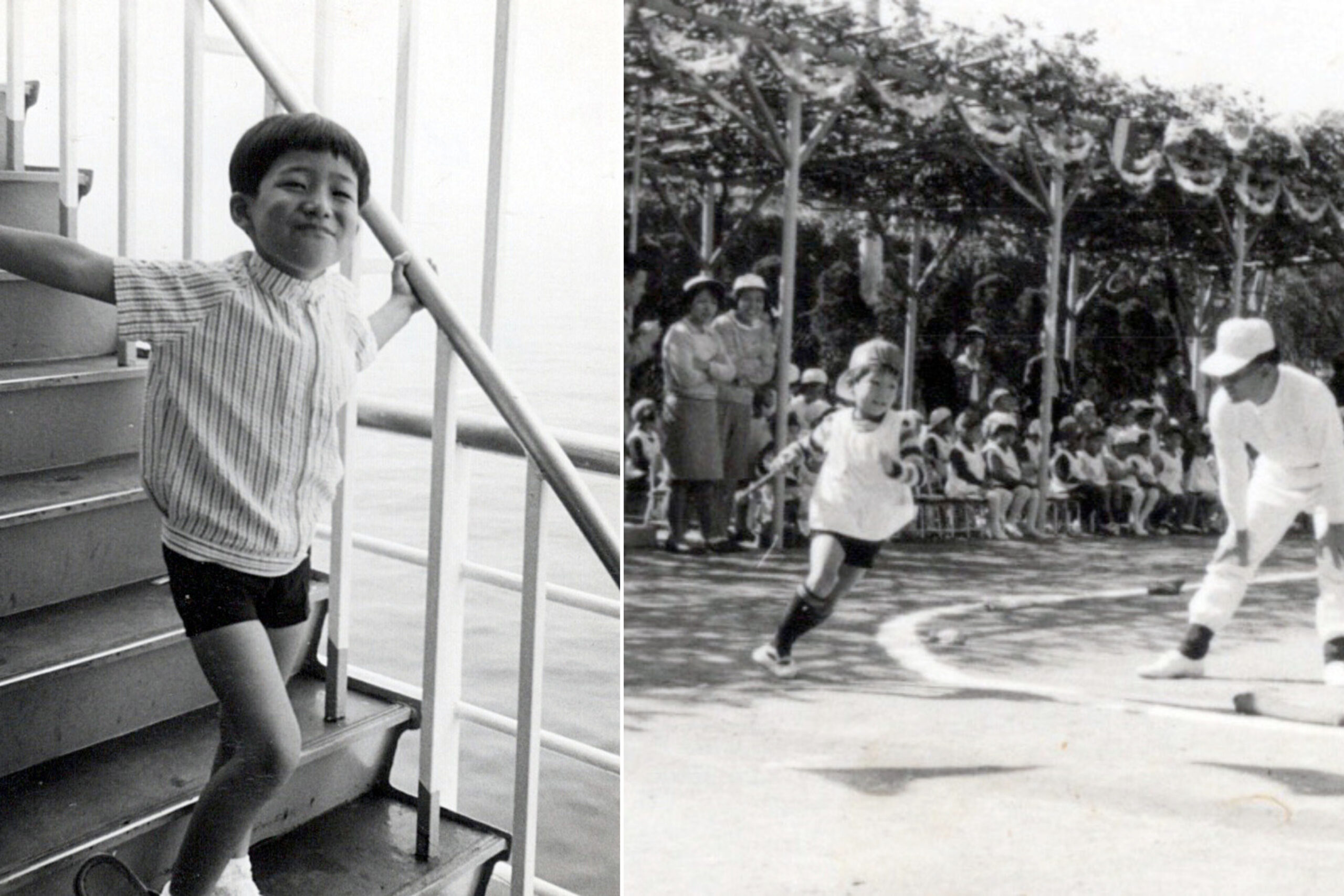
Nakagawa I liked to draw pictures. When I was in kindergarten, we went on a field trip to the zoo, and we drew pictures of animals after coming back. For some reason, when I was little, I drew animals in the shape of square boxes. I don’t remember why I did that, but I suppose animals looked like square boxes to me at that time. Since such drawings are rare and mysterious, the teachers praised them and displayed them at the entrance of the kindergarten. I still remember even now as I was so happy. But I was never good at it. Though I was a child, there were a lot of people who I thought were good.
―When did you become interested in designing?
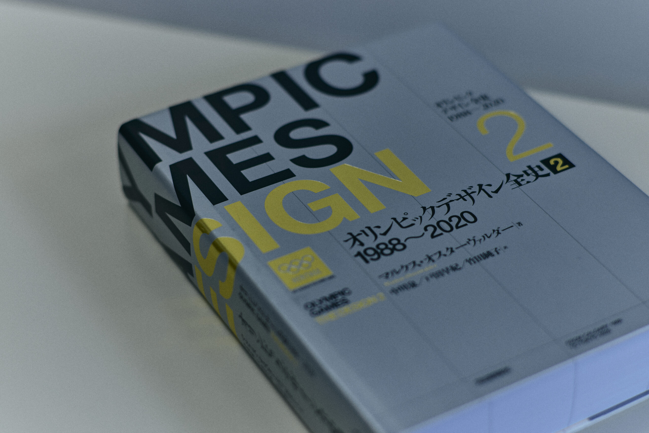
Nakagawa Around upper grade of elementary school. My parents loved movies, so they took me to the movie theaters when I was a child, and even let me watch foreign movies even before I knew what they were about. As I watched them, I started to like movies, and by the time I was in the upper grade of elementary school, I started going to the movie theater by myself. As much as I liked watching movies, I also liked collecting movie flyers, posters, and leaflets. I thought I can freely design letters by looking at the words of the title including ‘Star Wars’ and ‘Jaws’, and that’s when I started liking letter design. I wanted to design movie posters and leaflets someday, and that was the starting point for me wanting to become a designer. I immediately bought an introductory book on lettering with my pocket money and started designing letters in 3D.
―You mentioned that someday you wanted to be involved in creating logos for major sporting events. What made you interested in sports-related design?
Nakagawa When I was a university student, Nike was the first sports manufacturer to incorporate street fashion, and major sports manufacturers have begun launching sub-brands by signing deals with famous athletes such as Michael Jordan and Tiger Woods. At that time, I was very moved by the fact that sports have such an affinity with design and that it can be used not only in sports scenes but also in everyday life. That’s one of the reasons why I wanted to work in sports!
The other reason is at the 1984 Los Angeles Olympic featuring Carl Lewis. It was completely different from the Olympics I had seen up until then, and what had been an amateur sports festival turned into a commercial one, and became the biggest sporting event with even professionals participating. This changed the way the Olympics were presented. The same goes for the logo, and everything I saw was cool… That’s when I wanted to work for the Olympics! I hadn’t decided whether I wanted to work for a sports manufacturer or something else, but when I was in university, I knew I wanted to do sports-related design. So, for my university graduation project, I created a fictitious sports brand, thought about its CI (corporate identity) and VI (visual identity), designed the packaging for the products that company would sell, and created related posters. Ever since then, I have always wanted to pursue a career in sports-related design.
※CI(corporate identity):One of the corporate strategies to increase the value of existence by building a corporate culture and communicating its characteristics and uniqueness through a unified image, design, and easy-to-understand messages and sharing them with society.
※VI(visual identity):Any design element that visualizes the values and concepts of a company or brand and conveys the brand message through visuals.
An opportunity to move my life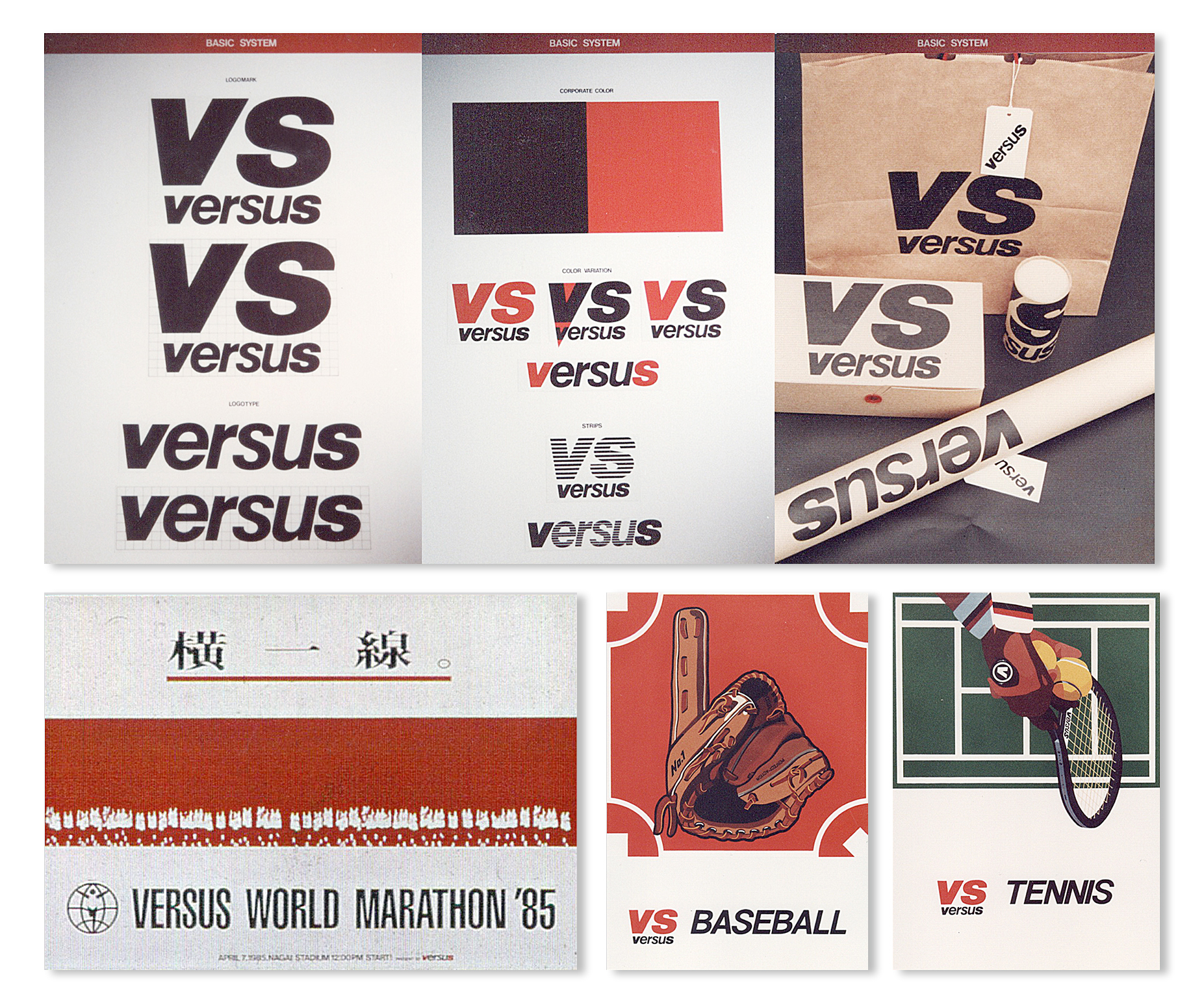
A glimpse of “character design”.
―You joined a design company in Osaka after graduating from university but what kind of work did you do?
Nakagawa The time I joined the design company in Osaka was during the Seoul Olympics, and one of our clients was Panasonic from Osaka, which was a sponsor of the Olympics. At the Olympics, there were cases in which the Olympic Games emblem and the Panasonic logo were used together, and we needed to create regulations for how to use the logos in such cases. I assisted in its production and created a very thick manual. I was a new employee who had just graduated from university, so I was pushed hard and had to work overtime every day, but it was a lot of fun. (laughs) Other than that, I made posters and design food packaging and brand logos. I was working for about two years, but I learned the basics of being a designer and a member of society at that company. Actually, I met my wife at this company.
―You are working on creating logo designs and CI and VI, but which job do you like the most?
Nakagawa What I like most is creating logo designs. There are many types of logos, such as companies and products, and the needs and requirements differ each time. After talking with the client and sorting out the direction, we design the logo, and then summarize those thoughts into the logo. I want the completed logo to last in the world for decades, not change in a year or two, so I want to make something that lasts as long as possible. However, there are of course things that can’t be conveyed through a logo alone, so after the logo, I think about what to design and how to design it and think about the touch points between the company and the customer, which I also like.
Some people say that any company’s logo is fine, but there are also people who say they want to work for a company because the logo looks cool. Also, when buying things, some people choose products with their favorite logo on them if they are the same product… Logos have the power to motivate people to take action, which is what makes them so appealing and rewarding.
―You dream to create a sport event logo someday came true. What is your next dream?
Nakagawa The next thing I would like to do is basically deliver a successful event, and maybe retire… which is a joke! I want to continue designing as long as I am healthy both physically and mentally, and as long as there are people who want to order from me. After all, I love sports, so I would be happy if I could continue to be involved in sports through design.
Other than that, I am interested in conveying my experience. I can’t teach you how to design, but I can teach you what to prepare and organize when designing, and the process of finishing it with your own sensibilities. When designing, there are times when you were able to create something good last time, but this time it wasn’t as good. But if you make the design process your own, you will make fewer errors, and you will be able to do it right almost every time. On the other hand, if you don’t make your own process, it will become like a one-shot or gamble. I am interested in conveying that experience and logics.
―You like sports but do you actually play sports, and not just watching them?
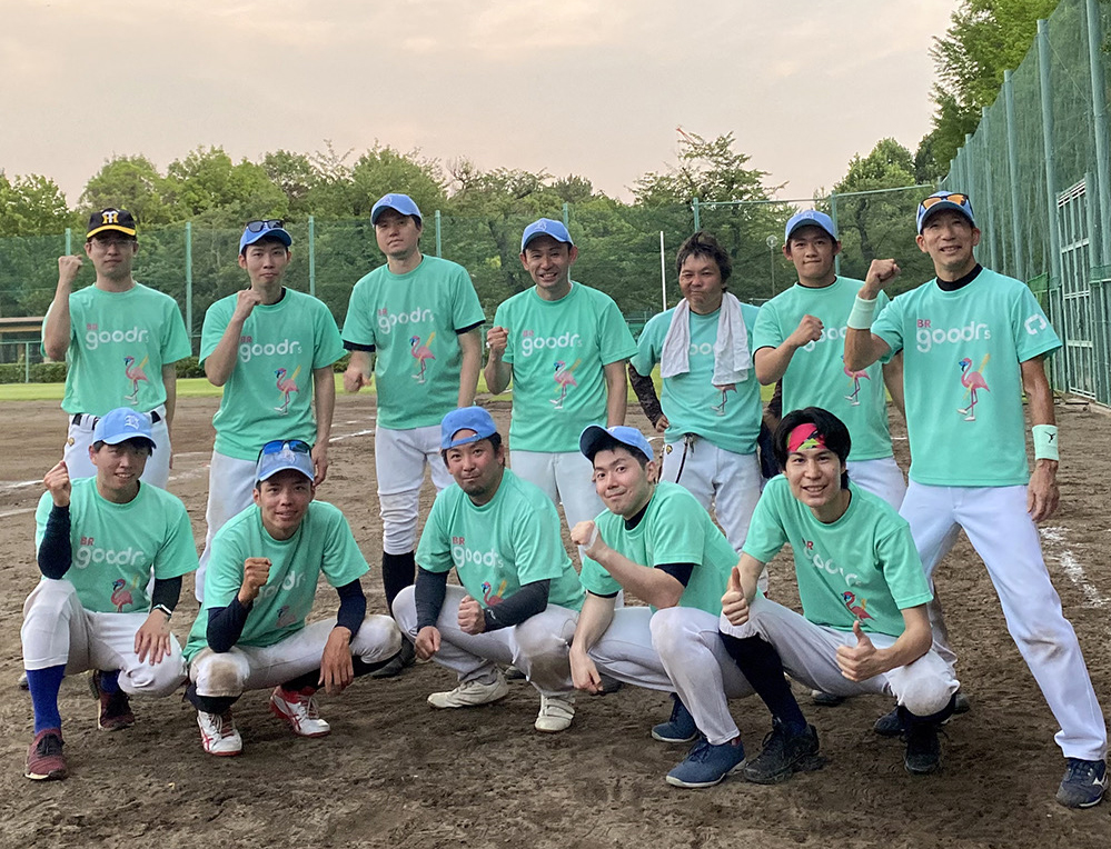
Nakagawa I play tennis, golf, and baseball about 5 times a week now. They are all sports that cannot be done alone. But there are matching apps for both tennis and golf, which are convenient because you can find people to play with. I have my own baseball team, and I am responsible for creating the social media platform and uniform design of the team. I have always liked sports and belong to the baseball club in high school and formed a lawn baseball team at university. After working for two years, I went to London to study design and English, but baseball gloves and a tennis racket were essential items at that time as well. In London, everyone gathered in a large park every holiday to play softball and tennis, so I asked them to let me in and we had fun together. I think I also improved my English communication skills there.
*Courtesy of Ryo Nakagawa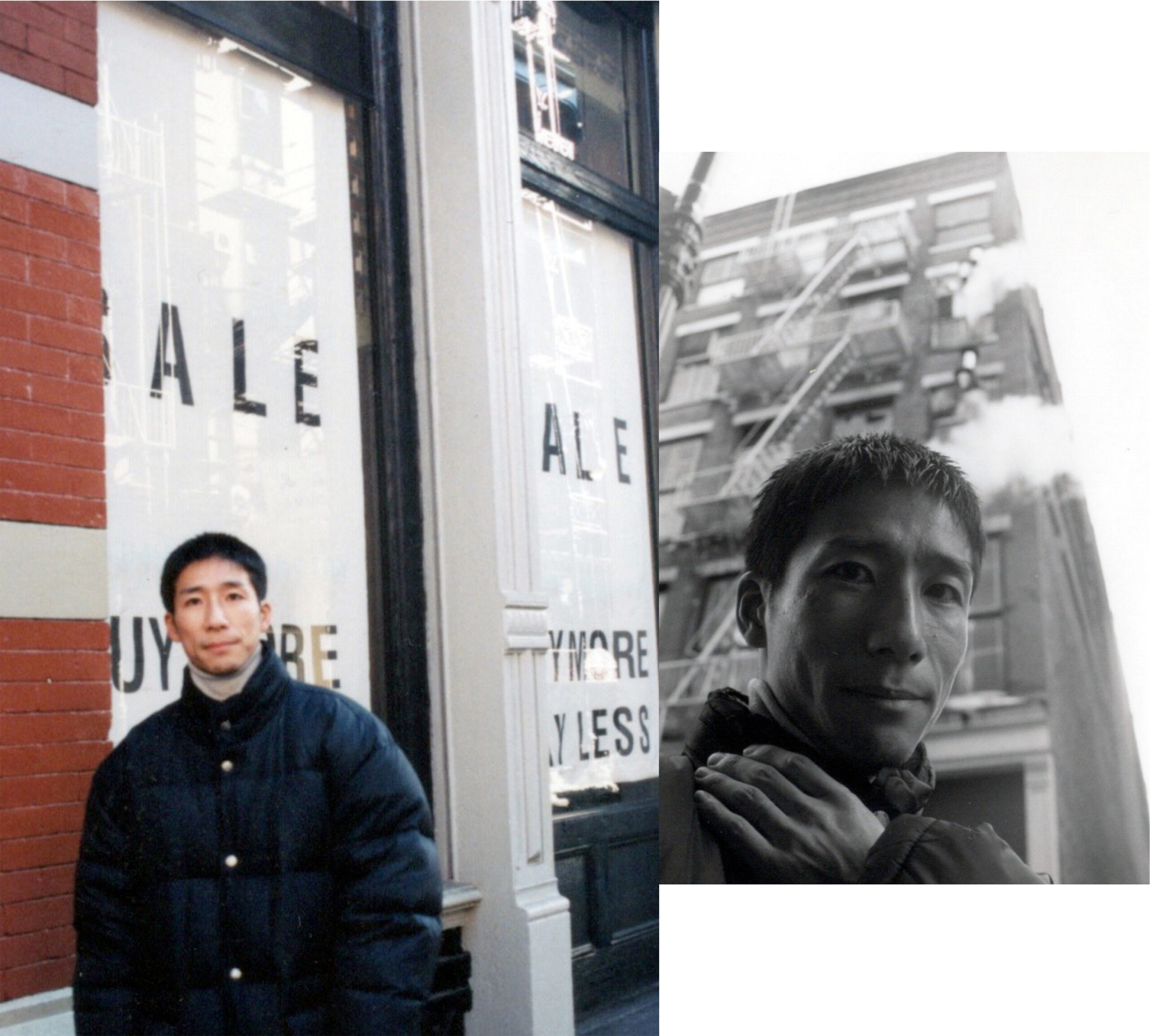
*Courtesy of Ryo Nakagawa
―What do you think is the appeal of sports?
Nakagawa Each sport has its own rules, and the best is chosen among them. There are complicated rules depending on the sport, but the desired results are very simple, such as “running fast” or “flying far”. I find the ultimate balance between its simplicity and the complexity of the rules appealing. The other thing is the beauty inside sports. For example, I am attracted to the running form of a fast runner or lean body movements. Also, we live in an era where we analyze numbers and images to improve performance, and this allows us to numerically express the limits of human beings. I’m also moved by the idea of pushing the limits.
As times have progressed and development has progressed, I believe that sports have become more scientific and rational. In Japan, there still tends to be a mentality of guts, and irrational ideas are sometimes brought up. Beyond that phase, I think “beauty” resides in something more sophisticated.
―”Beauty” is a keyword that attracts people to sports, right? When it comes to design, what do you think is beautiful?
Nakagawa There are many personal likes and dislikes, but I like simple things. Simple means not adding any decorative meaning to the design. There are many people in the world who think decorations are beautiful, and that’s one thing. What I think is beautiful is when the necessary elements with the minimum number of elements are expressed. The ultimate “simpleness” is beautiful.
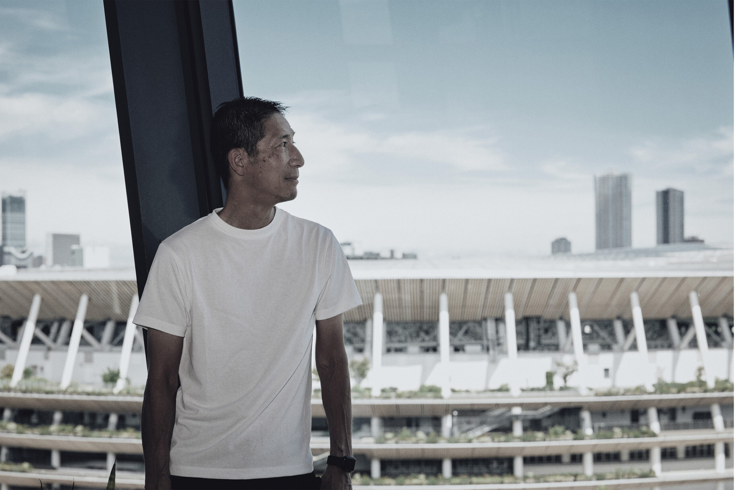
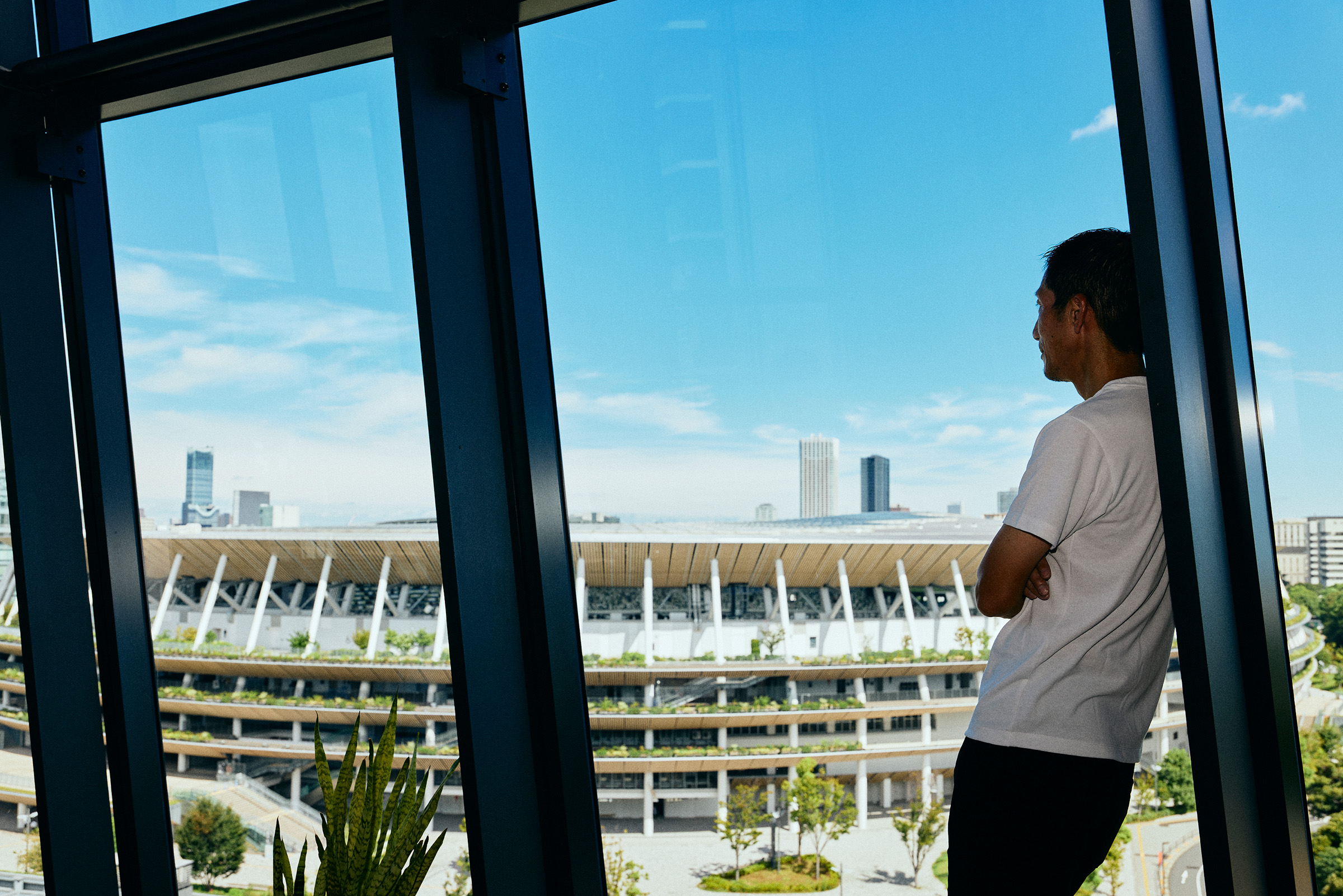
―The logo designed by you will color Tokyo in 2025. What kind of tournament would you like it to be?
Nakagawa After overcoming the Olympics without spectators, the World Athletics Championships Tokyo 25 will be held at full capacity at the new National Stadium with a full capacity audience. Basically, I hope we can complete the 9-day tournament without any major problems. On top of that, I would be happy if many world records are set and Japanese athletes play an active role. Currently I am working as the brand director of the Local Organising Committee of World Athletics Championships Tokyo 25 and the other day, we created core values to be shared within the Local Organising Committee. All of the people at the Local Organising Committee involved in the tournament were aiming in the same direction, such as “I want to make it a good tournament” and “I want to impress many people”, but there were differences in the words they used to express their feelings. So, we held a workshop and decided on words to express everyone’s feelings. That word was “Fantastic (=SUGOI) 9 days”. We want this tournament to spread “SUGOI” to people all over the world, like saying “hello” or “thank you”. “SUGOI=Fantastic” means “wonderful” or “excellent” and could be used for various meanings. I hope the nine days will be such that people around the world who watch the World Athletics Championships will be able to remember and say those words.
As a subtitle that further conveys the image of “Absolutely Fantastic (=SUGOI) 9 days in Tokyo”, it continues with“When you see this, your mind and body will start moving”. For example, a person who watches the World Athletics Championships may think about starting track and field, running, getting a job, finding a girlfriend, or anything else that will bring about a change in their life, and their mind and body will begin to move. Our hope is that this will serve as an opportunity for you. That’s also what I expect from this tournament.
―Finally, please give us a message for our readers!
Nakagawa Approximately 150,000 tickets for the World Athletics Championships Tokyo 25 have already been sold in advance (*As of the interview date, early September). The cheapest seats start at 2,025 yen, which is surprisingly reasonable, so I highly recommend you watch the tournament at the National Stadium.
In the case of track and field, not only one event is held, but many events are held around the stadium at almost the same time. It’s interesting to see the movements of the volunteers and competitors preparing for the competition, moving smoothly and effortlessly, and the robots that look like automatic vacuum cleaners moving around the field, picking up spears and discs and returning them to their original positions. In addition to the competition, there are many interesting parts that cannot be seen on TV, so I would be happy if you could buy a ticket and come to the venue to watch it.
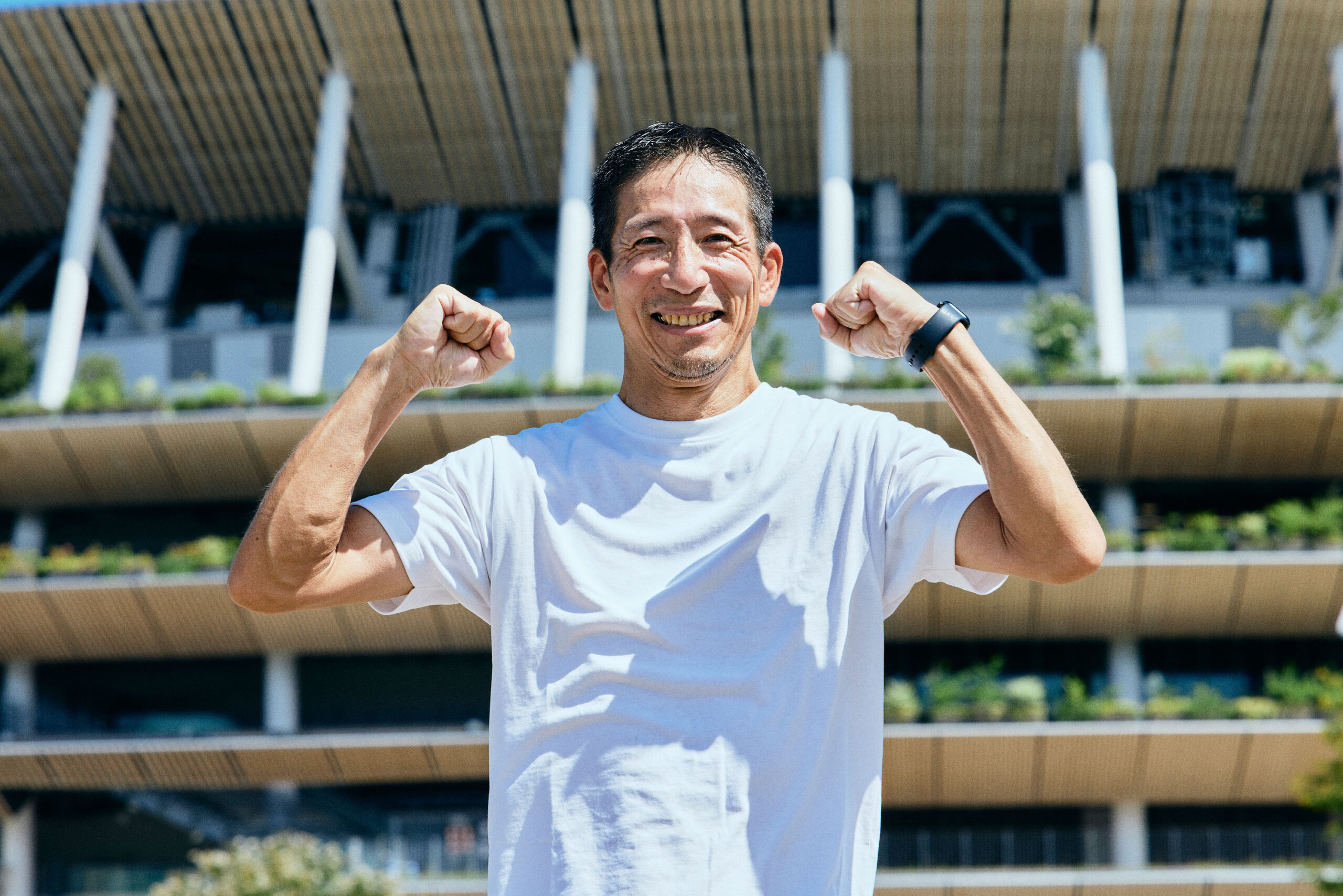
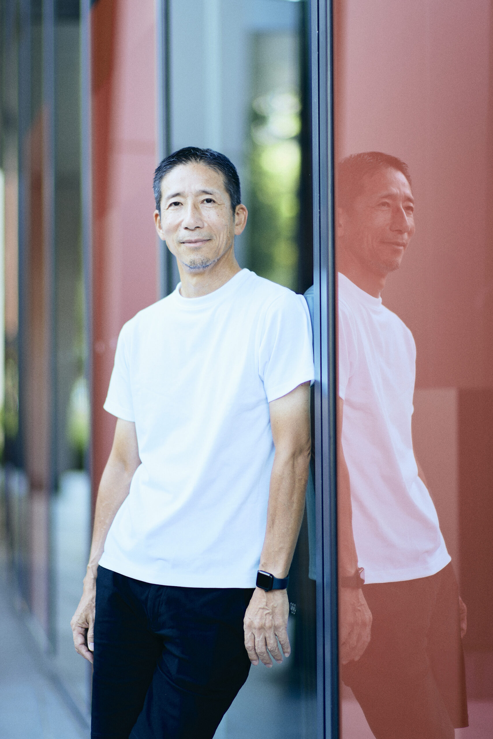
Ryo Nakagawa/ Born in Osaka
Creative director/designer
Graduated from Osaka University of Arts Design Department. After working at a major CI design company and brand consulting firm, established a private CI and logo design business under the name “DOT” in 1998. He is good at verbalizing brand values and visualizing them through naming and emphasizing the brand story. Currently he works as the brand director of the Local Organising Committee of Word Athletics Championships Tokyo 25 (WCH Tokyo 25 LOC).
《WCH Tokyo 25 LOC news “The World – Tokyo – Connecting” World Athletics Championships Tokyo 25 logo released press event report》
https://worldathletics.org/jp/competitions/world-athletics-championships/tokyo25/news/feature/logo-unveil-event
text by Rieko Kimura
photographs by Uta Mukuo
2025.04.08
Eyes filled with conviction. Sign language in which thoughts are spun together. Growing up in a deaf world, le […]
2025.04.08
Eyes filled with conviction. Sign language in which thoughts are spun together. Growing up in a deaf world, le […]
2025.02.28
An influencer who is now widely accepted by the general public, Takaya Mitsuka. The dream stage that he arrive […]
2025.02.28
An influencer who is now widely accepted by the general public, Takaya Mitsuka. The dream stage that he arrive […]